Correlation
Computing the Correlation
Select Regression → Correlation Matrix. In the resulting dialog, put "MVIRT" and "AWS" into the Variables box. Click "OK".
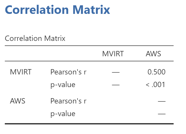
You should get this output:

Pearson Correlation Coefficient, r
The ".500" refers to the test statistic, which in this case is the "correlation coefficient," usually symbolized by the lower-case letter r.
Positive and Negative Correlations
When r is positive, it indicates that high values of one variable in the correlation tend to be found with high values of the other variable in the correlation. Likewise, low values on one variable tend to be found with low values on the other variable. For example, number of hours that students spend studying is positively correlated with their grade point average. Lots of studying tends to be found with higher GPAs, and little studying tends to be found with lower GPAs.
When r is negative, it indicates that high values on one variable tend to be found with low values on the other variable. For example, number of hours watching TV is negatively correlated with grade point average. Students who watch lots of TV tend to have lower GPAs, and students who watch less TV have higher GPAs.
Statistical Significance
The two asterisks (**) after the .500 are explained by the note at the bottom of the table: "Correlation is significant at the .01 level (2-tailed)." The asterisks are a way of alerting you to correlations that exceed the usual alpha levels of .05 or .01 in psychology. The ".000" under the .500, given the row label "Sig. (2-tailed)", refers to the p-value of the correlation. As mentioned earlier, when SPSS reports a p-value of .000, you should record that as p < .001.
Strength of the Correlation
The absolute value of r indicates how "strong" it is. The farther it is from 0, the stronger the pattern. In the graph on the previous page, the correlation was 0.5. If you scroll down to the scatterplot below, the absolute value of the correlation is 0.8. Looking at the scatterplots, you can see that the pattern - the linear relation between the two variables - is stronger for the one below. A stronger correlation means that it is more accurate to describe the data in terms of a straight line. As the data become more spread out from that line, the correlation decreases.
r-squared. One way to express the strength of a correlation is to square the r-value. r2 is the percentage of the variance or "information" in one variable that can be "explained" or "predicted" from the other variable, assuming a linear relation between them. If the correlation between AWS and MVIRT is r = 0.5, then r2 is 0.25, which means that 25% of the variance in people's beliefs about gender differences in moral virtue can be explained by their belief in conservative gender roles. This is called the coefficient of determination.
Degrees of Freedom: N-2
Finally, we need the degrees of freedom for the test. Here we find one awkward bit of output from Jamovi. To figure this out you will need to go back to Exploration and Descriptives. Put over AWS and MVIRT and get the basic descriptives. At the top is the number of observations for each variable. The smaller number is AWS. Thus, if N is 201, then the degrees of freedom is 199. This will not work all the time, but N is the number of observations in the data. You will need to know that to report the result properly.APA Style
To report the results above in APA style, you could write:
There was a significant positive correlation between AWS and moral virtue, r(199) = +.50, p < .001. This correlation indicates that people with traditional gender role attitudes tend to believe that women are more morally virtuous than men are.
Remember to always add a sentence providing an interpretation after you report statistical output.
Negative Correlations
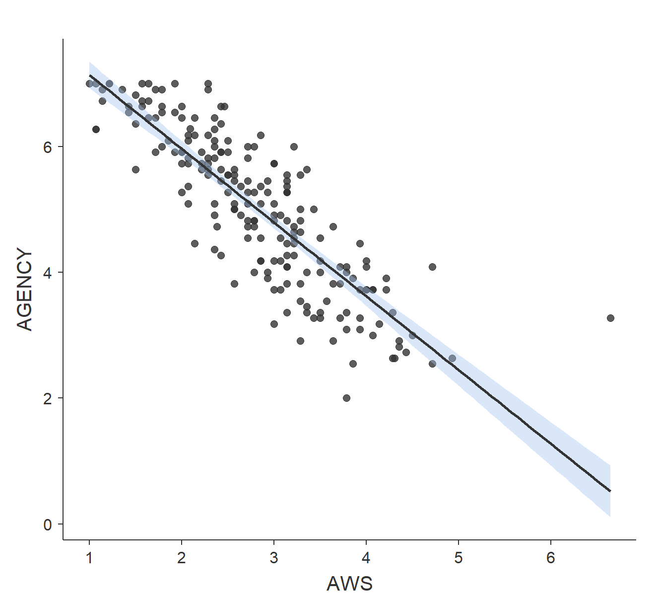
The scatterplot below shows the relation between the AWS and people’s beliefs in women’s "Agency", in which high scores indicate that women are competent and well-suited to positions of authority. The correlation in the scatterplot is r = -0.8. The scatterplot and the negative correlation indicate that high values on the AWS tend to be found with LOW scores on Agency.

Curvilinear Relations
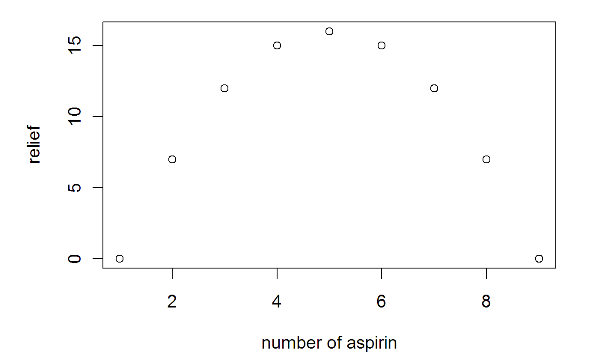
Correlation is designed to measure the linear relation between variables. A linear relation is very simple: if one variable goes up, the other goes up (positive correlation) or goes down (negative correlation). Correlation cannot detect a relation between variables that is non-linear (i.e., that cannot be described by a straight line). For example, look at the following data I made up describing the relation between the number of aspirin a person takes and the amount of relief that person feels:

As the number of aspirin taken increases from 1 to 5 aspirin, relief increases. However, after 5 aspirin, adding more aspirin doesn't increase relief; it decreases it. There is not a linear relation between aspirin and relief. Taking 9 aspirin is NOT better than taking 4 aspirin, as the graph above indicates.
The correlation between aspirin and relief in the example above is exactly r = 0. Imagine that someone asked what the relation was between aspirin and relief. If you relied only on the correlation coefficient, you might be tempted to answer, "no relation at all." But if you look at the scatterplot, you should reach a different conclusion. The lesson here is that you must always plot your data. If the data are curvilinear (not linear but curved), you should not use correlation - it will not accurately capture the pattern in the data.
So, what do you do if you detect a curvilinear relation? You can report the r-value but make sure you also state that the scatterplot indicated a curvilinear relation and attempt to describe it. In the example above, you could say that there was a generally positive correlation between number of aspirin and relief when number of aspirin increased from 0 to 5, but between 5 and 10 aspirin, the relation became negative.
Non-Significant and Not Curvilinear
What if the correlation is non-significant and there is no discernible pattern in the scatterplot? In that case, it is better to report the correlation value, identify it as non-significant, and not provide any interpretation: "The correlation between shoe size and IQ was not significant, r(28) = .13, p = .34."
Although it is beyond the scope of this course, there are ways to test for particular non-linear relations by adding polynomial terms. For example, the pattern in the aspirin and relief example given above is the result of a fairly common non-linear function called a quadratic, or second-order polynomial. For now, you can just describe the non-linear pattern in words.