Data Analysis Step 1: Plot Your Data!
Before you dig into statistical analysis, it’s a good idea to first get a graphical view of your data. This simple step can alert you to any serious problems that would undermine all your attempts to find statistical significance.
In the analysis bar, select Exploration and then Descriptives.
As mentioned on the last page, you need to be sure to set the "Measure" correctly for each variable. In particular, be sure to identify your dependent variable as "Continuous" if it is on an interval or ratio scale. You have already done that, so go ahead.
Checking Distributions
Many statistical analyses assume that the dependent variable is approximately normally distributed, which means that most of the scores are clustered around the mean and there are approximately equal numbers of scores above and below the mean. A good plot to use to investigate that assumption is the Box Plot or a HIstogram. We will look at both as both are easy in Jamovi. To get started, move "Tip_Percentage" to the Variables window and "Condition" to the Split by window. It should look as below.
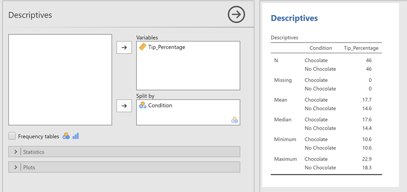
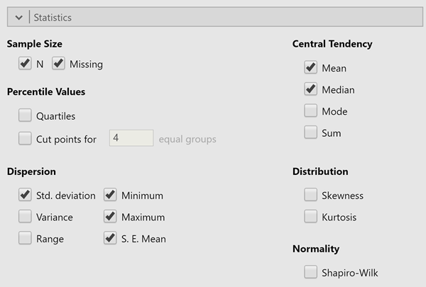
While here, click on Statistics right below Frequency tables and select, Standard Deviation and S. E.Mean (for Standard Error of the Mean), see below, as yoiu might want that information later.
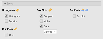
Okay, but I got you here to look at graphs of the data. They are very easy. Select Plots below the Statistics and select "HIstogram" under HIstograms and both "Box Plot" and "Data" under Box Plots. Below shows whatyou should select.
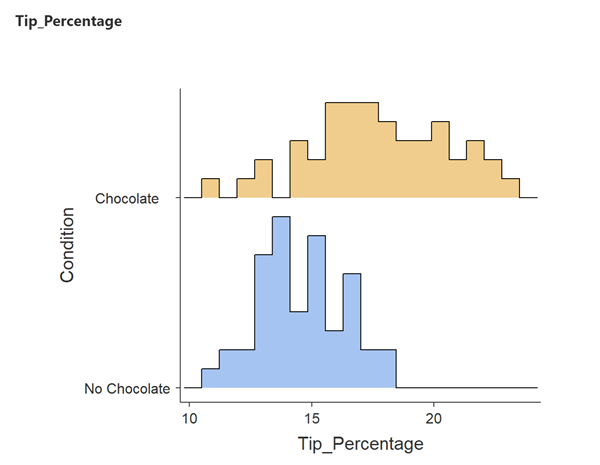
What you get should be:
HIstogram:
and Box Plot:
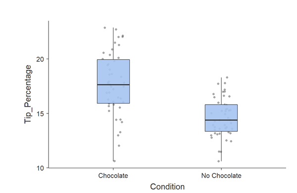
Interpreting a Boxplot
A boxplot is designed to graphically show you several pieces of information about the data at the same time:
- The shaded box in the middle shows you the boundaries of the middle 50% of your data. It is called the "Interquartile Range". The bottom 25%, or "quartile", is below the box, and the upper quartile is above the box.
- The horizontal line inside the shaded box is the median. Exactly half of the data is above it and half is below it.
- The whiskers extending above and below the box go out to EITHER the minimum and maximum values OR to 1.5 times the length of the box (1.5 times the Interquartile Range, or IQR), whichever is closer to the median.
- Sometimes (not in the present data), there will be data points outside the whiskers. These are worth looking at closely because they could be "Outliers", data points far from the center that may cause misleading results if you rely on the mean. SPSS has different markers depending on how extreme the scores are. If they are marked by circles, they are within 1.5 IQRs of the median. If they are marked by asterisks, they are between 1.5 and 3 IQRs.
This plot suggests that chocolate is having an effect: the tip percentage appears to be slightly higher in the Chocolate condition than in the No Chocolate condition. It also suggests that there is more variability in the Chocolate condition (the IQR and whiskers are wider). But for testing the hypothesis of the distribution, both hisogram and box plots show an approximately normal distribution for the tips given.
On the next page, we will proceed to testing whether the difference between the chocolate and no-chocolate groups is statistically significant.