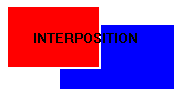

Textbooks use simple images to illustrate many of the perceptual cues that give rise to the impression of depth. These images allow the reader to focus on one particular cue at a time and to see how the impression of depth arises from that cue alone. In fact, each topic in this tutorial is headed with a simple drawing illustrating the depth cue. For example, the first depth cue to be discussed here is interposition which is the partial blocking of a more distant object by a nearer object. Check the small figure with the word interposition at the beginning of this page. There are two rectangles with the farther rectangle, lower and to the right, partially obscured by the nearer one, right? Well, actually both rectangles are at the same distance (the distance of the screen from your eyes). It is the interposition, overlap, that causes the sense of depth to arise. Usually the impression of depth caused by interposition alone is not very strong.
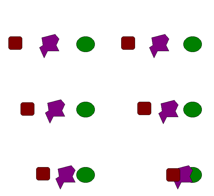
 For another illustration of interposition, look
at the image below. Here are three figures. They start out appearing at the same depth
when they are not overlapped. When the move together to overlap, then they appear to be a
different depths, with the figure on the left appearing nearest.
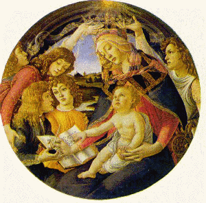
The virtue of studying depth cues in art rather than in simple drawings is seeing the cues in action, as it were. But the amount of depth that is perceived is not relevant, i.e., the sole purpose of these simple illustrations is to show that depth can be generated from the depth cue and not how that depth cue can be used to depict a realistic depth scene. In art, on the other hand, the amount of depth that is perceived is extremely important. The representation of depth has a specific goal not found in the simple drawings. Take the example of interposition. As stated above, the impression of depth that generally arises from interposition is quite minimal, but when the depth range that is being depicted is quite small, overlap may become a very important depth cue as in the painting by Sandro Botticelli below:
 Madonna of the Magnificat by Sandro Botticelli. |
Notice the foreground figures, which are all that are important for our present purposes. Here relative size and even relative height play little role in giving the depth order of the various figures (all the figures are roughly the same level and same size). Shadowing plays an important role in giving each of the figures their sense of three-dimensionality, but to tell who is in what position relative to another, the principle cue is interposition. |