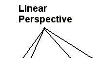

Linear perspective is a depth cue that is related to both relative size and the next depth cue, texture gradient. In linear perspective parallel lines that recede into the distance appear to get closer together or converge. Take the animation below. Initially, the scene appears flat. There are lines going in different directions. Click on the add perspective button and the lines move. The three parallel lines now are wider at the bottom and get closer together as they climb the scene. Does the scene now appear flat? Try the demonstration. After you have added the perspective, you can easily remove it by clicking the remove perspective button.
Does the image appear like looking down a road to the horizon? At least
that is the way it appears to many. Now the image has the appearance of
depth just by rotating parallel lines towards each other. Artist use this
cue to indicate how a building is oriented, among other things. A could of
examples will illustrate this use of linear perspective.
The first example is this painting by Jan Vermeer. The part of the building that is of interest right now is the front of the building. The bricks and other features of the front of the building are parallel, mostly, and they do not get closer together as they go across the scene. As such, we see the building as if we were looking at it from straight on. It looks flat.
 No
look at the painting to the left. Here is Paris Street: A Rainy Day
by Gustave Caillebote. Look at the building in the background. The
separation between the floors are clearly indicated. No, these lines
should be parallel or people would have very odd experiences walking from one
end of the floor to the next. Yet, these lines converge and give the
indication that the building is angled and that the surfaces recede in
depth. Thus, parallel lines indicate a flat surface and converging lines
that we see as parallel indicate a surface that recedes in depth. It might
help to go back to the interactive illustration above.
Because of the similarity of how this depth cue works, some people have argued that it is not a separate cue from relative size and texture gradient (Cutting, 1997). However, since linear perspective can be illustrated in ways so differently from relative size and texture gradient, I have kept it here.